Show me the money
Client: Green Jinn
Brand identity | Digital design | Illustration
Green Jinn are a mobile app company offering cash back for users when they shop with participating brands at UK supermarkets.
The brief was to optimise their existing brand icon and to create a suite of visual assets to bring an overall more cohesive brand experience to their website landing page and social media.
Logo Optimisation
Their existing icon - a grinning genie - was already a distinctive and memorable brand mascot that successfully set them apart from their competitors. It was, however, in need of fine-tuning to modernise its appearance, improve scalability and enhance brand recognition.
I redrew the icon, simplifying the lines, increasing contrast and adjusting the colours for better legibility at small scale. I also softened some of the corners and added a slightly cheekier expression to give him more character.
Brand Bank
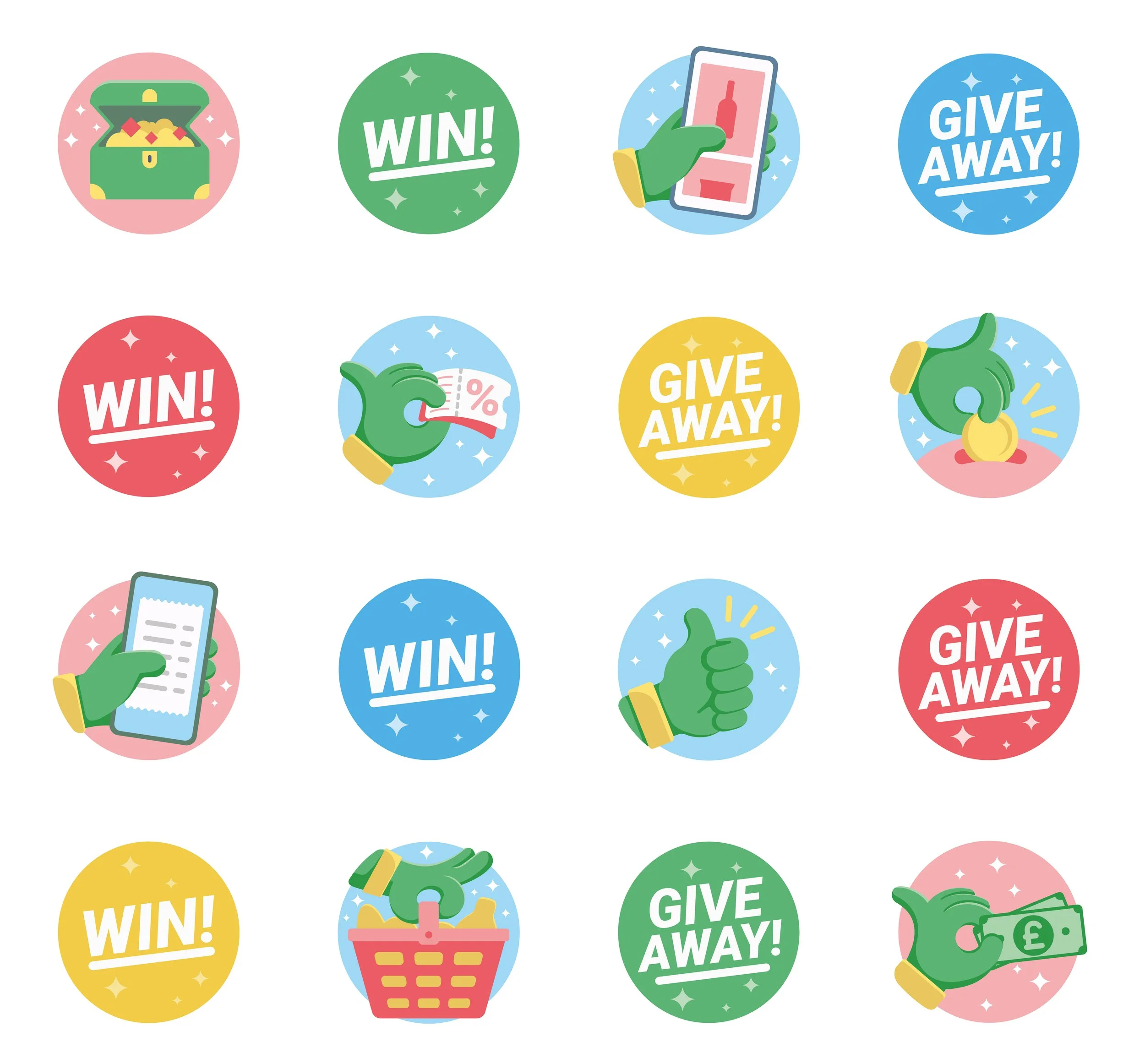
I created a suite of brand assets, including a refined colour palette, with a signature ‘genie’ green and vibrant accent colours to result in a fresh and fun aesthetic. I also provided a bespoke set of illustrated icons to cover a broad range of purposes, incorporating the genie’s hand where possible to make it feel own-able to the brand. Other assets included illustrated instagram backgrounds, roundels, flashes and arrows. This gave flexibility to the client’s in-house team to create ongoing content for their social media channels and website.
Landing Page
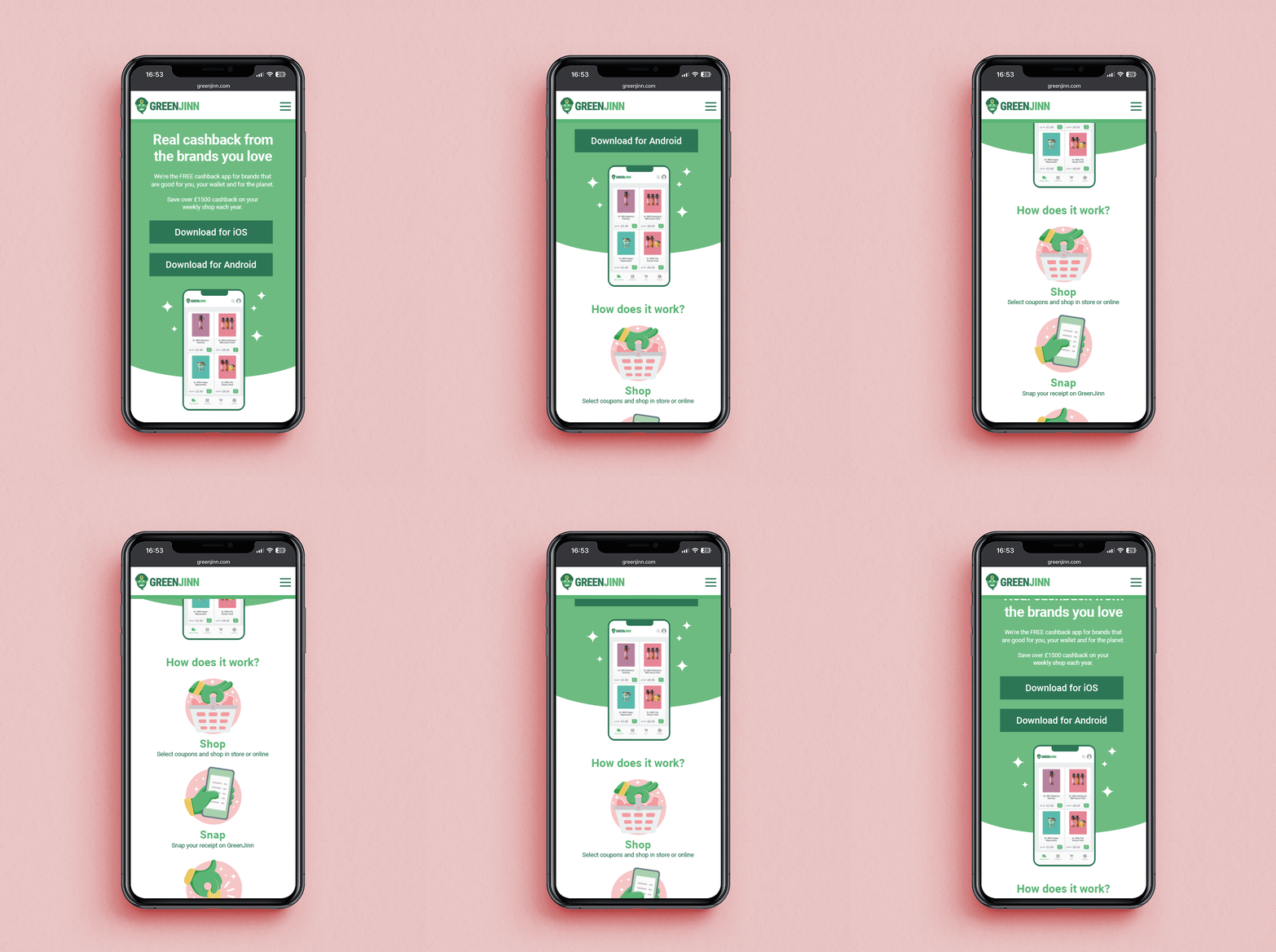
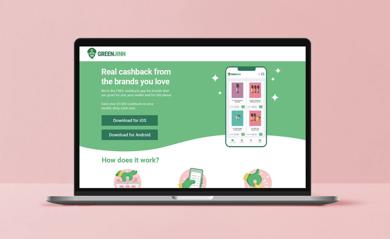
I designed a simple, focussed landing page that cuts straight to the chase with a clear call to action and effective communication of the app’s value proposition.


