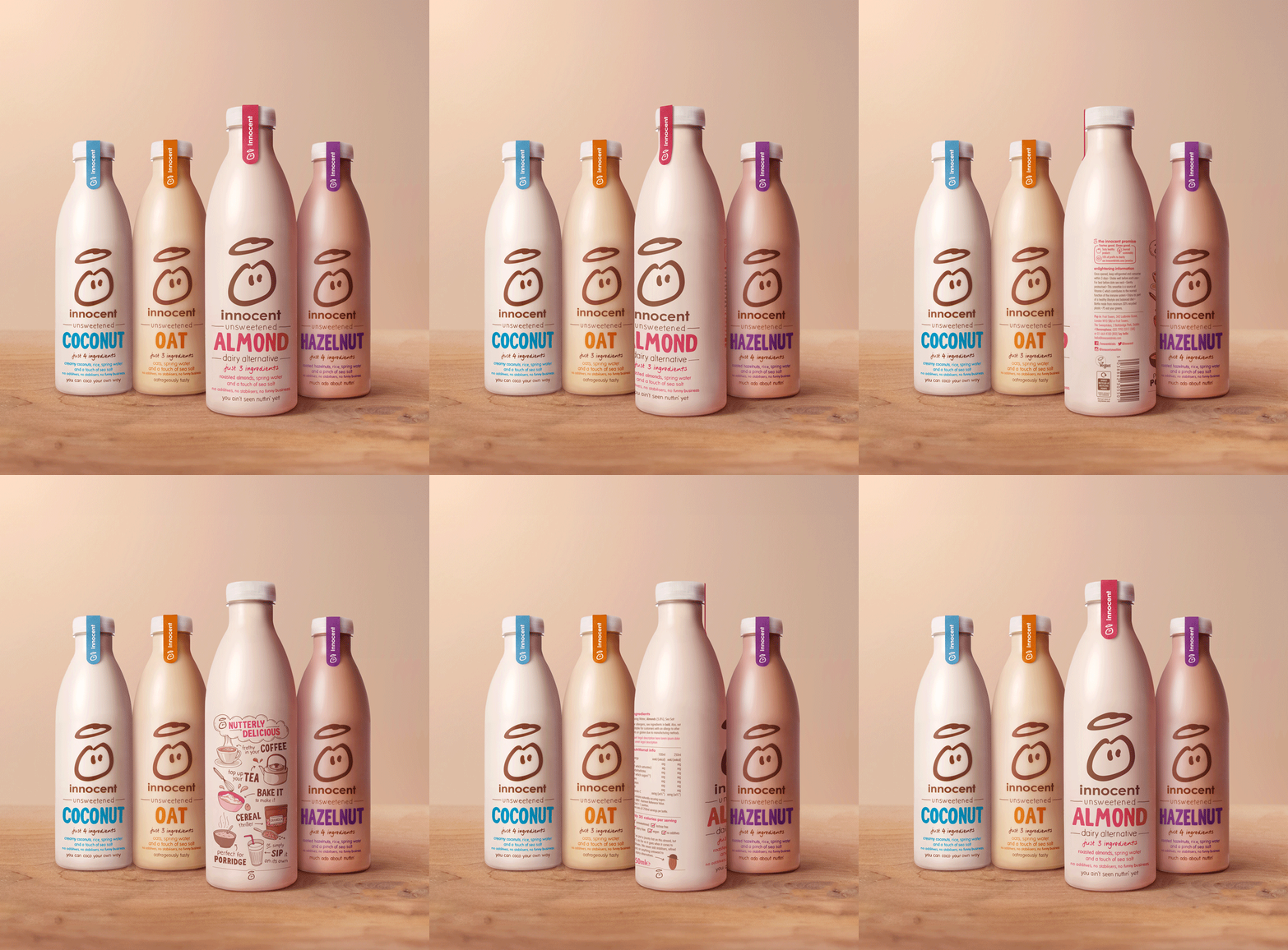
Packaging & NPD for innocent
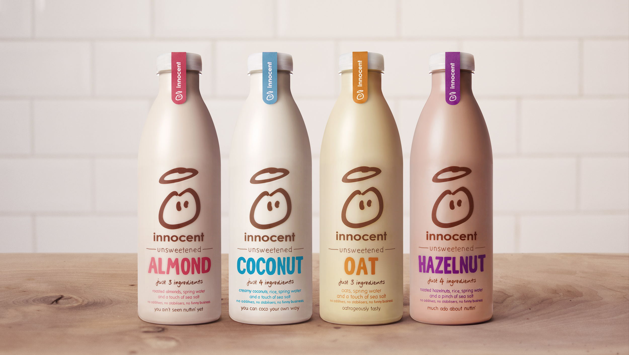
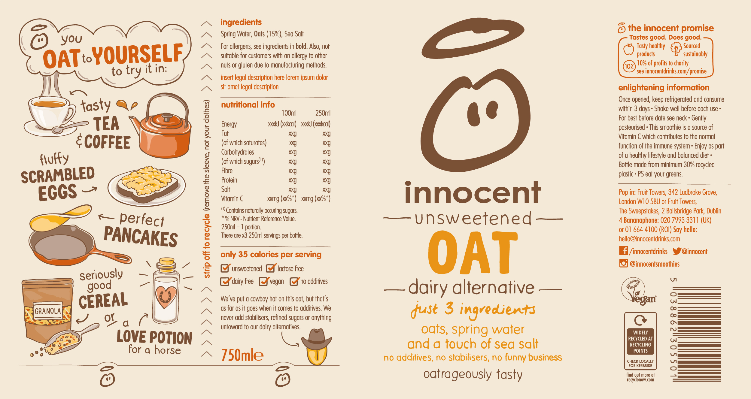
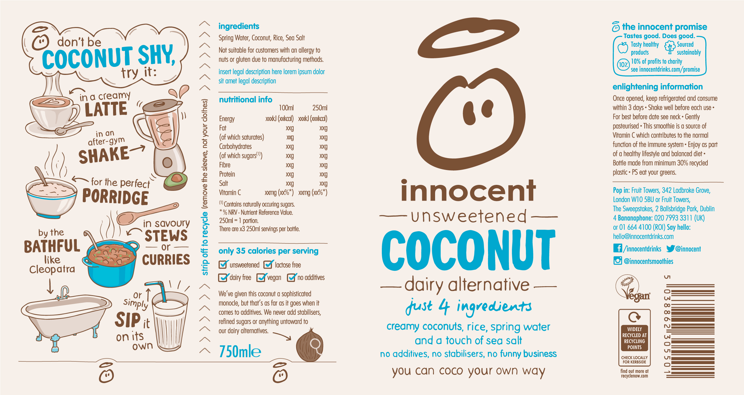
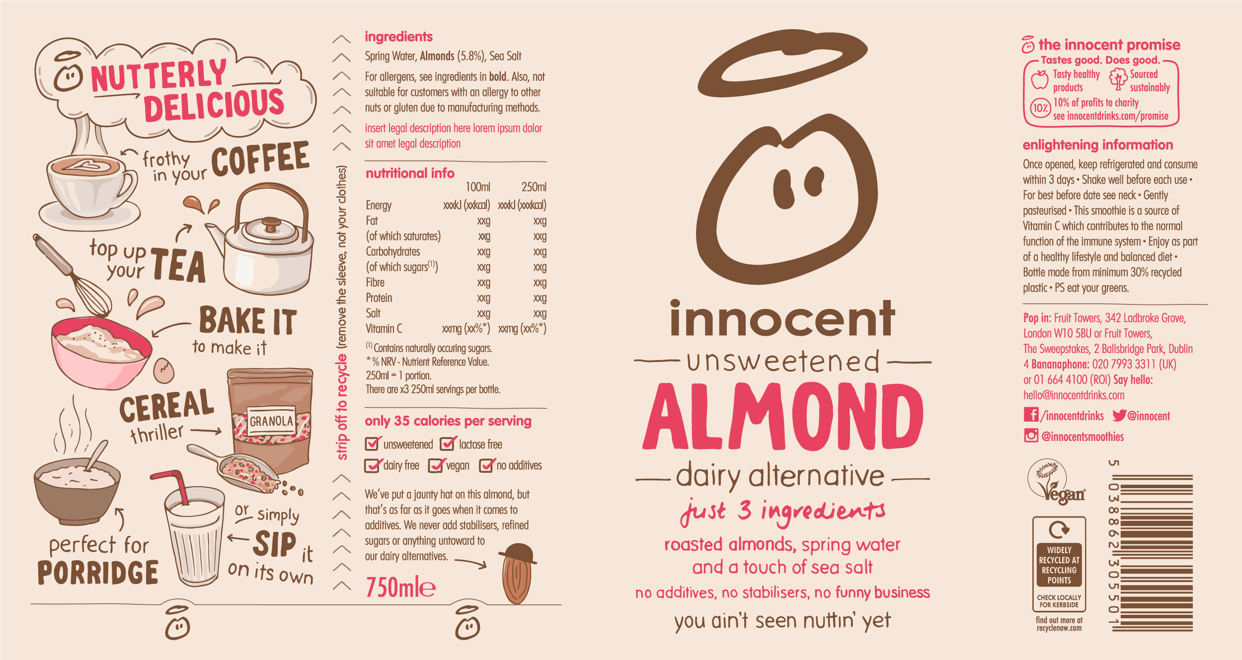
Using a structured, typographic design on the front of pack, I was able to achieve a paired-back aesthetic, while communicating several tiers of information about the product. All of the lettering was drawn by hand, in a style which lends itself to the charming, conversational tone that the brand is known for.
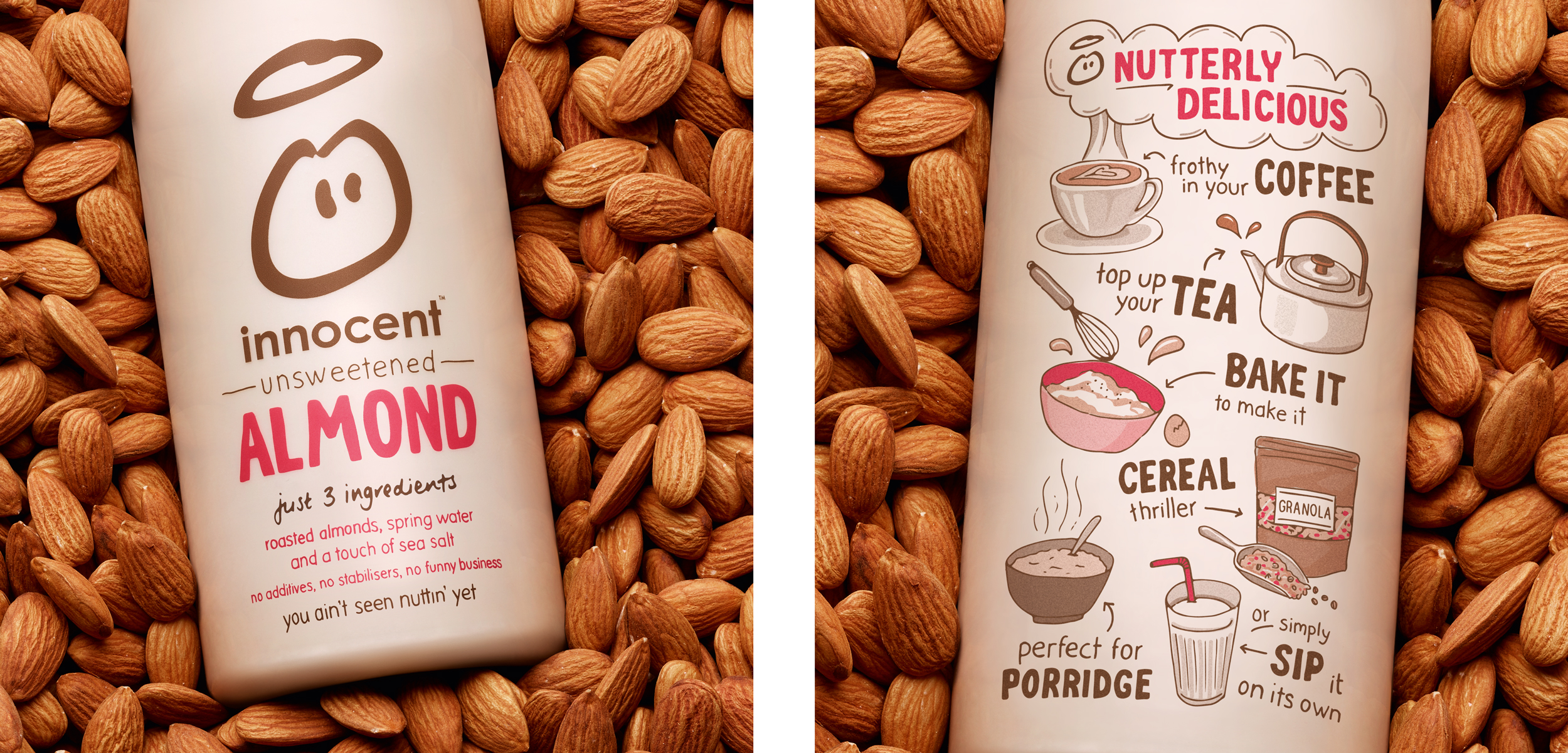
With dairy alternatives being a new category for innocent and a fairly recent trend in the UK, it was important for the packaging to clearly explain what the product is and how to use it. The uses are illustrated on the back of pack in a playful layout with a simple colour palette for each recipe.
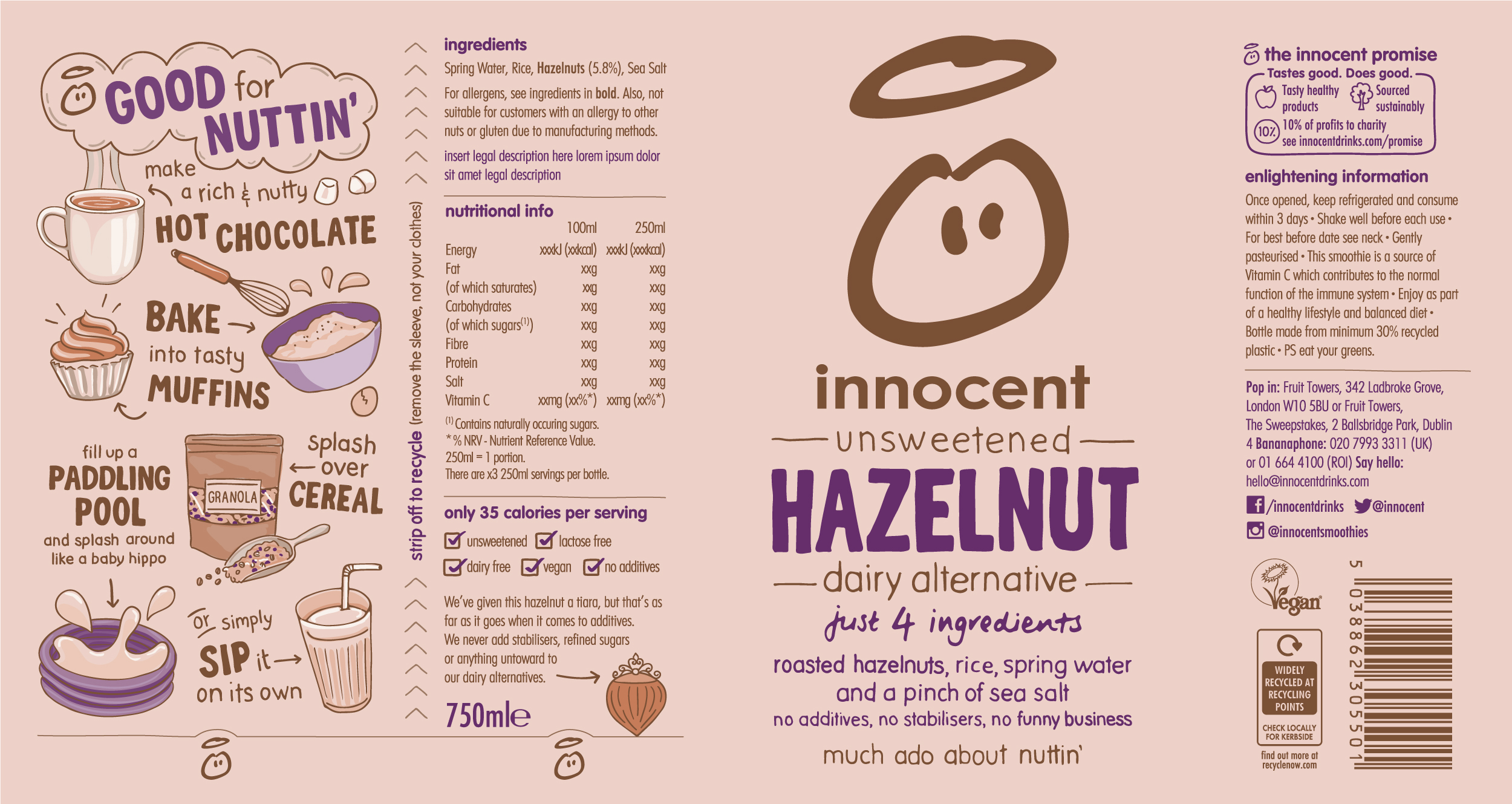
Copy by Hayley Redman
